
The QR Code on the Hang Tag
What Marketing Teams Need to Know Before the Artwork Goes to Print
A practical guide for retail marketing and brand-design teams — how QR works, what kills it on press, and how to keep it scannable on tags, packaging, and care labels.
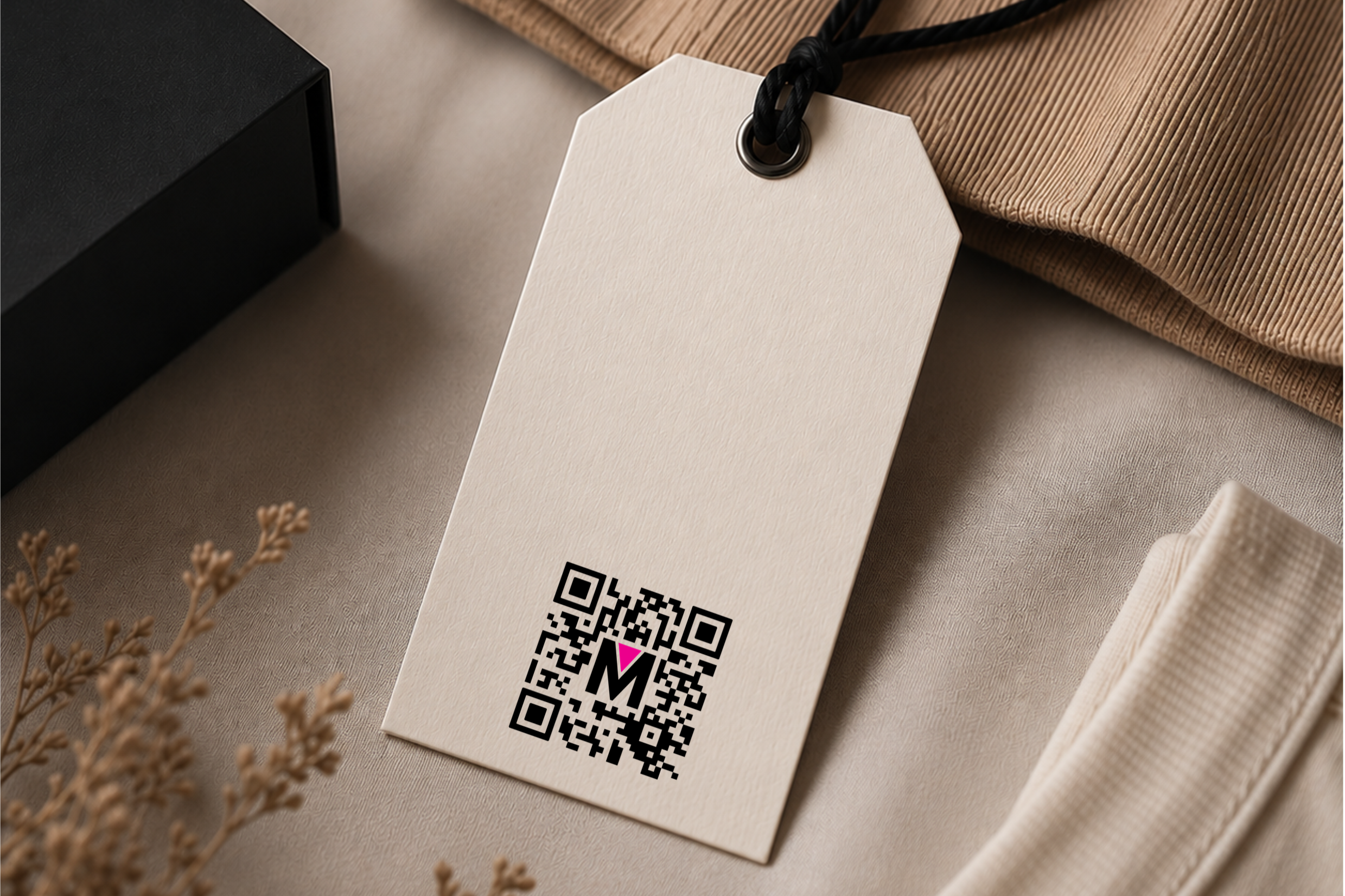
The QR code is now the single most-scanned piece of artwork on your garment. It is the bridge between the physical product and everything you want a customer to do next. Register the item, read the care story, claim a warranty, recycle it, prove it is real. Under the EU Digital Product Passport regulation, the QR (or a comparable 2D carrier) becomes the legal entry point to the product record. The carton tells the story once. The QR tells it every time the garment is picked up.
And it fails more often than your team thinks. Not because the technology is fragile — QR is one of the most robust data carriers ever standardised — but because the artwork crowds it, the colour palette flattens its contrast, or the print method on the chosen substrate cannot hold the module size. By the time a customer in a store points a phone at it and nothing happens, the cost is not a reprint. It is the moment of highest brand intent, wasted.
This guide is for marketing and creative teams at major retailers and brands. It covers what a QR is, what the print parameters mean, what fails on black-on-dark and white-on-dark, and what to design around on a hang tag, a carton, or a care label.
What a QR Code Actually Is
A QR code is a two-dimensional matrix data carrier. It is not a barcode rotated. It is a grid of black and white squares, called modules, arranged into a square symbol. Three large finder patterns in the corners tell a scanner where the code is and how it is oriented, like a compass. The rest of the modules encode the payload, usually a URL or a link to URL data, along with format and error-correction information.
The two parameters your team will hear about most are version and error correction. Version is the matrix size, from 21×21 modules (V1) up to 177×177 (V40). Bigger version means more data, but smaller modules at the same printed size. Error correction comes in four levels — L (7%), M (15%), Q (25%), H (30%). Higher level means the code can be partly damaged, dirty, or scuffed and still read. For apparel DPP where the tag is folded, washed, and handled, Q or H is the sensible default.
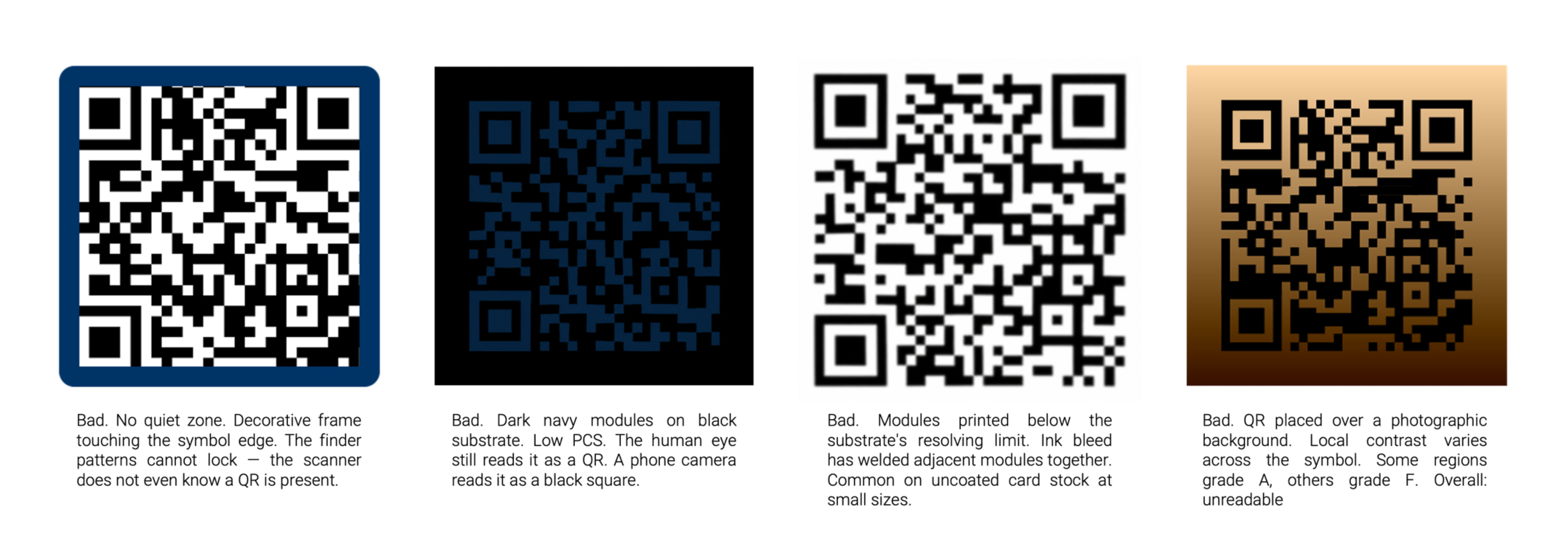
There is also a mandatory quiet zone — a clear margin of background colour around the symbol. The QR standard requires at least four modules of quiet zone on every side. This is the single most common print failure. The marketing artwork crowds the code, the quiet zone disappears, and the scanner cannot lock on. The code looks fine to the human eye. It will not read.
How Retailers Actually Use It
Three or four years ago, the QR on a hang tag pointed to a campaign landing page. Today the same QR is expected to serve product registration, care information, authenticity verification, recycled-content disclosures, repair-and-resale entry points, and within the next twenty-four months in the EU, the legal Digital Product Passport itself.
The shift the marketing team needs to understand is from URL-on-hangtag to GS1 Digital Link. The new generation of QR codes on apparel encode a structured identifier, or SGTIN in GS1 language, that resolves to different content depending on who is scanning and where. The same physical QR can present a marketing experience to a consumer, a compliance record to a customs officer, and a resale authentication to a secondary-market platform. That is a marketing asset hiding inside an engineering decision. Better yet, the same QR code can deliver specific information, depending on who is scanning and in what environment.
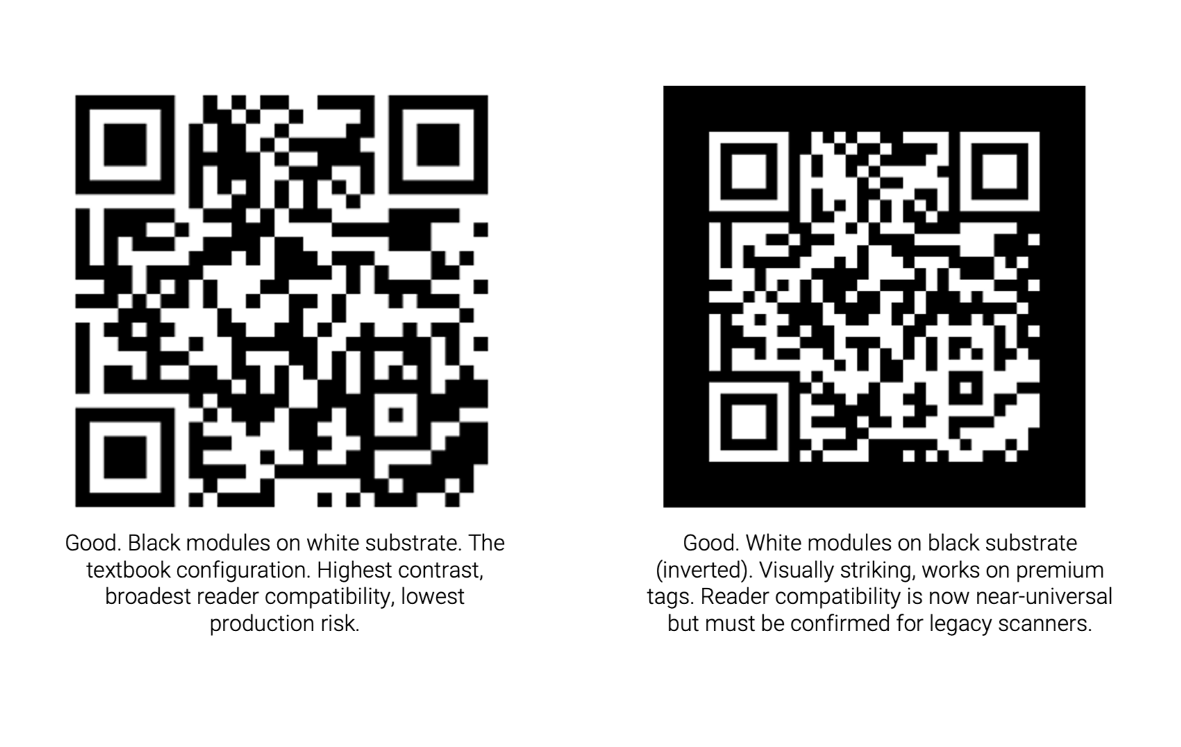
What a Good QR Code Looks Like
Before we discuss what kills a QR, here is what a clean, production-ready code looks like. Both of the examples below scan reliably with any phone camera from 2018 onward. The black-on-white version is the workhorse — high contrast, ample quiet zone, modules well above the minimum size for a hang tag scanned at twenty centimetres. The inverted white-on-black version is also reliable, with the same module geometry, the same quiet zone width, and a contrast ratio that meets ISO/IEC 15415 print-quality grading. Both should grade A or B.
The Print Parameters That Actually Matter
Four numbers decide whether your QR reads or not. Everything else is decoration.
Module size (X-dimension). The printed width of one square in the grid. Practical minimum for phone-scanned hang tags is around 0.5 mm; comfortable target is 0.6–0.8 mm. Below 0.4 mm you are gambling on the camera and the store lighting. A Version 4 code (33 modules) at 0.6 mm prints at roughly 20 mm square plus the quiet zone.
Quiet zone. Minimum four modules of clear background on every side. At a 0.6 mm module, that is 2.4 mm of empty space around the symbol. No logos, no copy, no decorative frames, no foil borders inside that margin. The single most common reason a QR fails in production is that someone put the brand mark too close.
Contrast ratio (PCS — Print Contrast Signal). ISO/IEC 15415 expects dark modules to reflect less than 25% of incident light and light modules more than 70%. In design language: black on white passes, black on cream passes, black on light grey is marginal, black on navy or darker is a failure waiting to happen. The phone camera sees luminance, not hue.
Error correction level. Pick this once, with the print partner, based on the substrate and the application. For a sewn-in care label that will be washed fifty times, choose H. For a sticker on a poly bag, M is enough. The higher the level, the more dense the code becomes for the same payload — which is why specifying it early matters for layout.
What a Bad QR Code Looks Like
Each of the codes below is a real failure mode we see in apparel-program artwork at least once a season. Each one looks acceptable to a designer reviewing the artwork on a Retina screen. Each one will not scan on a production hang tag.
Black on a Dark Substrate — Why it Always Fails
This is the most common designer ask we receive, and the answer is always the same: it will not work. The black-on-black or black-on-dark-navy hang tag is a recurring marketing instinct because it photographs beautifully and reads as premium. But the QR code is not a graphic element — it is a machine-readable symbol, and the machine reads luminance, not aesthetics.
The PCS requirement is unforgiving. If the substrate reflects less than about 60–70% of incident light, contrast against black ink collapses. The scanner sees near-uniform dark, finds no finder pattern, and times out. True for black uncoated card, dark Pantone, navy woven label, or brown kraft.
There is no print-engineering fix. You cannot make black darker than black. The only solution is to change one of the two surfaces — either lighten the substrate behind the QR with a white inset or knockout panel, or invert to white modules on dark. The latter is where most premium brands have landed.
White on a Dark Substrate — The Inverted QR
Inverted QR codes are the right answer for premium and dark-palette hang tags, and they work.Reader compatibility for inverted QR was a real concern five years ago. It is no longer a serious concern today. iPhones, Android cameras, and every major scanner SDK released after roughly 2019 read inverted QR natively. The remaining edge case is a small population of legacy industrial scanners — relevant for warehouse and customs use cases, less so for consumer scanning.
Two practical notes on inverted print.First, the white needs to be genuinely white. A cream, a beige, or a screened tint will fail the contrast test. On thermal transfer printing — the workhorse for variable-data care labels — this means a dedicated white ribbon, typically a full-resin formulation, printed on a black coated tape. The ribbon-substrate match must be qualified before production. Second, on a textile substrate, the white pigment can wick into the fibres and blur module edges. Specify a coated black tape that is qualified for white-resin ribbon. This is not a corner to cut.
For premium hang tags printed offset or letterpress, the same logic applies.Specify a true opaque white ink with sufficient density, run a press proof, and have it graded against ISO/IEC 15415. If your print partner cannot produce a verification report, change print partner.
Designing Artwork: The Hang Tag
The hang tag is the QR's home turf.It is the surface the customer touches in the store, the surface the EU regulator expects to find the DPP entry point on, and the surface the resale platform will scan two years later. Treat the QR area as a protected zone in the artwork brief.
Minimum printed size on a hang tag: 18 mm square.Comfortable target: 20–25 mm square. Below 18 mm and the in-store scanning experience starts to degrade depending on light. Add the four-module quiet zone outside that.
Placement rules to write into the brief. Never overlap the QR with imagery, gradients, or brand pattern fills. Never place it across a fold or a perforation. Never put copy inside the quiet zone — and yes, the URL printed as text under the code counts as copy and must sit outside the quiet zone. Never print it over foil. Foil reflects directionally and will fail PCS at certain viewing angles even when it looks right on press.
Designing Artwork: Folding Cartons + Packaging
On a folding carton, the QR is competing for surface with regulatory marks, barcodes, brand graphics, and increasingly an EPR symbol. The risk on cartons is not module size, there is usually room, it is varnish, foil, and creasing. A spot UV varnish over the QR creates micro-reflections that throw off the scanner under store lighting. A QR that crosses a carton crease will not read once the box is folded. A QR printed close to a metallic foil panel can pick up reflected light into the quiet zone and fail PCS.
Specify a no-varnish window over the QR and a five-millimeter buffer to any foil, emboss, or fold line. On flexo-printed kraft, drop error correction to Q minimum to absorb ink-bleed risk. On offset-printed coated board, M is fine and the modules can be smaller.
Designing Artwork: The Care Label
The care label is where the QR has to survive fifty wash cycles and still scan. This is the hardest of the three surfaces and the one where the print method choice — not the artwork — dominates the outcome. The dominant method is thermal transfer printing (TTR), in two configurations: black ribbon on white coated tape, and white ribbon on black coated tape. The first is the workhorse for variable-data DPP labels; the second is the premium and branded-look option.
Module size on a care label is constrained. The label real estate is small, the QR competes with care symbols and fibre-content copy in multiple languages, and the substrate is a textile tape — not a paper card. Practical minimum module size is 0.5 mm; comfortable is 0.6 mm. With error correction H and a payload of a GS1 Digital Link URL of roughly 50 characters, you are typically printing a Version 4 or Version 5 code at around 18–22 mm square.
Ribbon-to-substrate qualification is non-negotiable. Wax-resin ribbons on uncoated tape will not survive industrial washing. Full-resin black ribbon on a coated white satin tape will. Full-resin white ribbon on a coated black satin tape will, but only if the substrate top-coat has been qualified for white pigment. Press proofs and ISO/IEC 15415 grading after a standardised wash cycle are the proof of life. Do not accept a print sample that has only been graded fresh-off-the-press.
A brief note on woven QR codes. It is possible to weave a QR symbol into a jacquard label and it looks beautiful. It cannot carry variable data at a cost the program can absorb, so it is an edge case for heritage and luxury treatments — not a production option for serialised DPP at scale. If a partner proposes woven QR for an item-level DPP program, the answer is yes but costly.
The Pre-Flight Checklist for the Artwork File
Before the artwork goes to print, the marketing or creative lead should be able to answer yes to each of the following.
If any answer is no, the file is not ready.
1. Is the QR symbol at least 18 mm square on a hang tag, 20 mm on a carton, 18 mm on a care label?
2. Is there at least four modules of clear, uniform-colour quiet zone on every side?
3. Is the contrast between dark and light modules genuine luminance contrast, not just hue contrast? (Black-on-cream yes, black-on-dark-navy no.)
4. If the configuration is inverted, has the print partner qualified the ribbon-substrate combination and run an ISO/IEC 15415 grade?
5. Is the error correction level specified in the artwork brief, and matched to the substrate's wash and abrasion exposure?
6. Is the QR clear of folds, perforations, varnish layers, foil panels, and brand pattern fills?
7. Has the symbol been test-scanned with at least three phone cameras under store lighting, not on a designer's monitor?

The Bottom Line
The QR code is the smallest, most-scanned, most-regulated piece of artwork your team will ship this year. It is also the easiest one to get wrong, because the failure modes look fine on a screen. The fix is upstream: write the print parameters into the artwork brief, qualify the ribbon-substrate combination before the press run, and treat the quiet zone with the same discipline you treat the logo.
At Maxim we run this discipline across twenty-one apparel factories. Our EcoTrac platform pairs the variable-data QR with chip-level identity on a hybrid UHF + NFC tag, with print parameters qualified for both black-on-white and white-on-black TTR, and ISO/IEC 15415 grading on the production line. The marketing team writes the brief. The platform makes sure the QR still reads on the resale floor five years later.